 The French railways, SNCF, were pioneers of high-speed electric traction. They have held high-speed records since the 1950s.
In general, electric traction is the poor relation of railway enthusiasm. The engines are styled around an unashamed and utilitarian functionality…there’s precious little romance. I particularly like the fact that these engines face-both-ways.
Electric railway traction affords a number of substantial advantages over diesel and steam…
Centralised power generation gives each engine access to more power than it could ever produce on its own, and because the engine isn’t carrying its own weight in fuel, it uses less energy to go more quickly…this power provides additional performance and can be used to accelerate quickly, maintain high speed, or travel over difficult country (mountains).
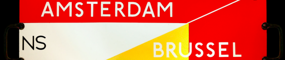
Furthermore, the absence of exhaust fumes makes these trains ideal for lines with lots of tunnels. Hence, electric traction was quickly adopted for the railways in Switzerland. The design of the electric loco allows for it to face both ways – forward and back. The position of the driver’s cabin, at the front, and on top, gives a better view of the track.
The electricity is delivered to the engine througha third rail, or by an overhead wire. The system of overhead wires is called the catenary…it’s a lovely and elegant arrangement held in tension by weights.
The 20C was the century of electric traction…in Switzerland, and France, and Japan, electric traction provided reliable high-speed services across every kind of landscape.
France is just the right size for this kind of railway…big enough for high-speed to be a worthwhile alternative to the car and aeroplane; small enough for overhead supply to be possible.
Here is a picture of the 1960s version of the engine, painted in a lovely deep red. The Capitole is the service between Paris and Toulouse. The service was part of the pan-European TEE network.
I especially like the styling of this engine, with its wrap-around windscreen. It’s the Harley Earl of locos…and a bit like the Citroen DS (see Roland Barthes for that).
 I travelled on this servcice in the 1970s…it was fantastically sophisticated. The cars were fitted with floor-to-ceiling glass walls, double-glazed windows with internal blinds and super armchairs. It was well worth the ticket price, and made everyone on the train look fabulous.
Glamour, sophistication, travel, and trains…brilliant.


