There’s a nice short piece, by Ian Jack in today’s Guardian, about the repeal of ancient laws (and about railways). You can read it, here
http://www.guardian.co.uk/commentisfree/2012/apr/20/ian-jack-abolishing-obsolete-laws
There’s a nice short piece, by Ian Jack in today’s Guardian, about the repeal of ancient laws (and about railways). You can read it, here
http://www.guardian.co.uk/commentisfree/2012/apr/20/ian-jack-abolishing-obsolete-laws

Karen brought home a bag of old photographs that had belonged to her mother. Here is her grandfather; Karen’s mother’s father, Julius Slonim, standing on the platform with a snow covered observation car in the background. Looks like he’s about to leave on an adventure…
Julius was a successful business man in London. He ran an import and export business that specialised in Bohemian crystal. The family was named after a town in Belarus. We think he came to Britain at the end of the 19C and called himself after his home-town.
We never knew Julius and the facts about the older generation, their arrival in Britain and their struggle to get on are all a bit hazy. Anyway, it’s a good job he got out when he did. There won’t be many Jewish people left there now.
He travelled to the USA too. This picture looks like it could have been taken in America. The design of the observation car is typically American. The hat-and-coat combo is a little film-noirish, so the picture could be from the 1930s.
Julius played an prominent role in the Jewish community of the East End. He was active in the London School Board. The LSB promoted, and provided, elementary education amongst the poorest communities in London. It’s efforts were later incorporated into the LCC.
Back to America…The open platform at each end of the US style passenger cars is typical. Nowadays, we only see it when Presidential candidates embark on whistle-stop tours in the run-up to an election. Here’s a picture of Barak Obama at the back of the train

The idea is that, before the age of air travel, the train could carry politicians to within reach of even the most isolated community. The whistle would blow, and people would gather around for a speech.
You can get a sense of what this was all about from this picture of Harry S Truman in 1948. In an age of blanket TV coverage, the Barak train was more a PR stunt.

Three cheers for Julius.

If you’ve been up late, you may have heard the shipping forecast on BBC Radio.
This is a litany of strange place-names, with weather conditions, announced for the benefit of mariners and lighthouse keepers. If you’re at sea, it’s a practical lifesaver; if you’re on land, it provides for a moment of quiet psychogeographical romanticism…
Like a lot of BBC Radio, it provides a consistent backdrop to everyday life.
This is a handy cotton hanky with the map of the shipping forecast divisions

Obviously, I find the same kinds of associations and escape in the imagery of trains, travel posters and so-on. It’s a short step from trains to boats. Speaking of which, it was great to find a whole box of ship models, including a couple of hearty tug boats. On closer inspection, it turned out these were “waterline” models, scratch-built from cardboard and toothpicks.

A quick look on the interweb thingy and it seems they might even be Bassett Lowke models. Bassett Lowke models were world famous in their day and are a staple of collectors. Bassett Lowke was quite a personality in his own right too. He had a house designed for himself by Charles Rennie Mackintosh. The house is in Northampton.
I’m not sure the ship models are quite good enough, but we’ll keep checking.

In addition to the bigger ships, there were two submarines. Great, I can play out the battles of the Atlantic – think of the films In Which We Serve (1942), The Cruel Sea (1953), and Das Boot (1981). In winter, I can even wear my Royal Navy duffel coat.
My favourite models are those of the tugs. These simple boat shapes reminded me of the famous tug in Cassandre’s shipping poster (see header above), with a nod to the primitive painter Alfred Wallis.

Wallis was a retried seafarer who was discovered, living on the beach at St Ives, by Ben Nicholson and Christopher Wood. They recognised him as an authentic and unspoiled genius. His false perspectives were especially appealing to these proto-modernists.
You can see lots of Alfred Wallis pictures at Kettle’s Yard, Cambridge.
Once you’ve figured out where all this comes from, you get back to the source – Alfred Wallis (not Picasso).
By a strange coincidence, the connection between boats, submarines and trains will also be evident at Chatham Historic Dockyard, Kent. They have a gallery show of artists who specialise in railway engines…It’s just opened and will be on for a while. They also have pictures from the National Maritime Museum too. Ship ahoy!

 This is a post about Herbert Matter and his identity for the New Haven Railroad. Actually, I don’t really need to say very much. It’s all here and written by Jessica Helfand too!
http://observatory.designobserver.com/entry.html?entry=4697

By the late 1940s, the New Haven Railroad boasted one of the most modern fleets in the country — and arguably, what was, in its time, one of the most identifiable symbols in America.
In April 1954, Patrick B. McGinnis became president of the New Haven Railroad. An outspoken and controversial executive who vowed to lead train travel into the space age, his tenure would last less than two years — yet during this time, his artistically-trained wife initiated a program to rethink the company’s corporate image through the use of graphic design principles. Working with Florence Knoll on the then-new executive suite at Grand Central Terminal, Lucille McGinnis convinced her husband that the railroad needed a new logo.

Enter Herbert Matter, Swiss-born designer, photographer and Yale professor whose own education was framed by apprenticeships with Cassandre, Leger and Le Corbusier. Assisted by Norman Ives, Matter developed a forceful typographic pairing of uppercase “N” and H” letterforms that included monochromatic as well as two-color (red/black and later, blue/black) variations. The new visual identity debuted in April of 1955 — exactly one year after McGinnis took office. Matter was named Design Director for the New Haven Railroad a mere two months later.
Matter’s new identity was a tour-de-force of mid-century modernism: restrained, colorful and sleek, the bars of color that graced the long, steel bodies of the train cars amplified their streamlined form. The logo debuted on a series of new lightweight trains, and their formal improvements (which required a series of trains, called EP-5’s, that had a new size and shape) were articulated by three wide horizontal stripes of color. “To add zest, the stripes would not taper and curve but would end in sharply raked angles,” notes train historian Joe Cunningham. “Roof cab and nose top would be black, noses would be white with a horizontal black diamond surrounding the headlight. A wave of the contrasting color would rise to a peak below the headlight diamond. On sides and ends, block letters would form an N above an H, with the colors set off from the background.”

Curiously, it was the color palette that proved difficult to resolve. In order to facilitate its selection, technicians at the GE plant produced two trains, one in canary yellow with black, and the other in a trio of white, black and red-orange. Matter chose the latter which, coincidentally, matched the red scarf, black coat and white gloves that the fashionably-attired Lucille McGinnis wore to the GE plant the very day the newly-painted trains were being presented. “Matter noted that yellow was fashionable but showed dirt,” Cunningham explains. “Mrs. McGinnis agreed, saying the red looked powerful.”
There are a couple of further things to say. The exaggerated slab serifs of Matter’s identity implicitly recall the mid 19C origins of the railroad. The design choice to work with pre-modern and serifed letterforms was in marked contrast to the prevailing typographic aesthetic of the mid-century, machine-age, modernity in the USA.
The engine livery also has an interestingly sharp, dazzle effect. This is bit like the camouflage patterns developed for battleships during WW1. You can see the geometry clearly on the front of the can units.
Here’s a Matter cover design for Fortune magazine

Matter was also art director and photographer for the Eames Studio and for Knoll. I’ve posted before about the Eames Studio and their films.

Herbert Matter’s name has been in the news recently. The family has discovered a whole garage full of Jackson Pollock paintings.

This is the standard work on Matter at present. I believe that Kerry Purcell has been working on something more complete and up-to-date.
I also found an excellent model site, which is full of technical information about the New Haven Railroad in 1959.

 London – Paris – Milan.
The extension of railway infrastructure across huge distances and the integration of services had the effect of accelerating time and compressing distances. This phenomenon was understood and described as a force. The experience of this was brilliant and unsettling at the same time; a bit like a fairground ride.
The railway expresses this mechanically. The machine ensemble is a complex, large and interactive mechanism. Literature and art explore the psychological and visual consequences of this acceleration too. Cubism, photography and cinema each feed from this speeding up of everyday life.
Of course, the most profound expression of this shift in our experience of time was provided by Einstein. It’s no accident that Einstein conceptualized his theory living in a boring city, doing a boring job and riding on trams.
Here’s a lovely diagram of Einstein’s train thought-experiment that describes relativity

I wonder if Einstein ever took the tram in Hamburg? See my post below, about Dada. Anyway, here’s a picture of Einstein arriving in London.


This is a post about Otto Dix, Dada, collage and trams. Anyone who knows about art and design will know the destination – it’s Schwitters and Merz. All aboard.
This is Otto Dix’s collage of an electric tram. I saw it in a report about a sale at Sotheby’s, where it made over 2million. I love the odd perspective, the letters and numbers and arrow. Best, I love the manic grin of the driver. He’s dangerous!
Otto Dix was a German artist who promoted a form of New Objectivity in painting during the 1920s. In a way, he was painting the obvious hardship and social upheaval in the aftermath of WW1. Somehow, he found a way of making it compelling and beautiful too.
It’s kind of structural too. He makes the misalignments between power, money, prestige and integrity evident. The collage element in this work suggests a nod in the direction of Dada.

The electric tram has a special place in railway history. It’s also significant in relation to art and to the experience of the city. Accordingly, it played a key role in the transformation of collective identity in the modern city. The significance of these effects is hard to judge, especially if you are used to living in the city. However you can track their impact, and over the 20C, by measuring the Flynn effect.
The Flynn Effect describes the phenomenon that metropolitan populations across the industrial world appear to make substantial and sustained gains in IQ scores throughout the 20C. Furthermore, the improvements in intelligence are in quite specific areas. These are associated with spatial awareness and cognitive reasoning.
Living in cities and riding on trains actually makes you cleverer. Amazing (and brilliant)!
Notwithstanding all the usual clap-trap about modern life and hell-in-a-handcart, its pretty obvious that the acceleration of modern life and the patterns of the great machine-ensemble of the city must impact on your cognitive development. Personally, I’m not surprised that it’s positive. That’s the way it feels.
Anyway, back to trams. If you’re a bit unsure about what trams look like and how they feel, check out Dziga Vertov’s Man with a Movie Camera (1929). There a terrific sequence of trams leaving their shed.
 The film is the classic day in the life of the city documentary. It claims to be an experiment in cinema and to have abandoned the usual convections of theatre etc. The camera eye, or kino eye, promoted by Vertov was a modernist way of seeing facilitated by optical technology.

The shift in perception made possible by accelerating technology also plays itself out in the fields of art and music.
 There’s a new print of the film available as a dvd and with a new soundtrack by Michael Nyman. Another of Nyman’s works is an opera about the time that Kurt Schwitters spend designing tickets and stuff for the Hamburg bus and tram service.
 Schwitters is famous for a type of modernist collage art that he made out of the printed paper detritus of everyday life. Sraps of labels, tickets and type are combined to recreate the fragmentary and elusive experience of modern metropolitan life. He called these works, Merz.
 The art practice promoted by Schwitters has had a profound effect on art and design in the 20C. The whole thing became a bit of an industry.
Here’s a picture of Schwitters by El Lissitzky
 I got a return ticket. So, we’ll be coming back to tram’s and modern life…

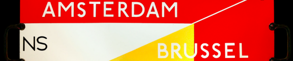
This is a post about railway related ephemera. These things aren’t strictly strictly railway ephemera. They weren’t produced by, or behalf of, railway companies. However, they do show the symbolic power of the railway engine as a trademark or brand.
I’ve got a small matchbox label collection. I love the slightly primitive quality of art direction and the cheap-and-cheerful production values. These come from a mixed album I just purchased at auction. There are tractor images, Swiss road safety labels and a nice lot of UK pub and beer typo lables.
 Karen, my wife and fellow collector (we met looking at the same thing), was a bit anxious about more bits of paper in the house. However, even she was forced to admit that the album had a few interesting things in!

This is another post about psychoanalysis and the railway.
It’s about the correspondence between the emotional experience of train travel and the language we use to describe these feelings. So, it’s also post about language.
Both, Ludwig Wittgenstein and Sigmund Freud would surely have agreed that, in the end, it is always about words. Or maybe, it’s in the beginning? I guess it depends on your perspective.
You can see what I’m talking about in the picture by Ravilious, above. The landscape, with its evident historical and antiquarian meanings, is used to provoke powerful emotional feelings of familiarity…
Anyway, I’ve posted before about the obvious similarity between train-travel and the slightly otherworldly and detached sensations we have when dreaming. That similarity suggests that we could transfer ideas and interpretations from psychoanalysis to railway travel. This transfer has worked in relation to cinema and psychoanalysis; so, why not?
The point about Freud, as I’ve mentioned before, is that he provides a vocabulary for talking about and describing hidden things. In psychological terms, this is all the stuff that is buried in the sub-conscious. The interpretation of inner-feeling, in relation to environment and experience, is entirely appropriate in the traveller.
I would say that the relative detachment of the railway traveller (from the world through the window) is one of the most singular pleasures of railway travel. It’s all very well, until you see something you shouldn’t have…
There are a number of films that explore the consequences and moral ambiguity of voyeurism. Some of these films even explore these themes in the context of the railway carriage.
I want to use the example of Carol Reed’s great film, The Third Man (1949). There a scene on a fairground ride that exemplifies what I’m talking about.

The Third Man is one of a number of films directed by Reed based on the work of Graham Greene. Greene’s story is set amongst the war-torn ruins of Vienna. Representatives of the victorious powers have partitioned the city. The resulting administrative confusion, along with the inevitable shortages of essentials, are exploited by a criminal underclass.
An American writer, Holly Martins, played by Joseph Cotton, arrives in Vienna at the invitation of Harry Lime. Matins is shocked to discover that Lime is dead. His attempt to investigate the death of his friend reveals the unpleasant truth that Lime was well known as a racketeer involved in the sale of corrupted penicillin.
The film is divided into two main parts. In the first, Lime’s personality is recalled as charming and compelling. At the same time, the facts of his duplicity begin to be pieced together by Martins.
In the second half, Lime suddenly reappears. His death is revealed to have been another fraud, aimed at escaping justice. Lime attempts to justify himself to his friend before fleeing through the sewers. Eventually, he is cornered and dies like a rat.
The Third Man shares a number of themes with Greene’s other work. The circumstances of war, along with the terrible revelations of brutality and genocide, combine with Greene’s Catholic belief to suggest a world where corruption and original sin are commonplace. For Greene, the struggle against the forces of evil remained largely futile. Greene’s Catholicism retained, accordingly, a particularly bleak sort of outlook.
Perhaps the most famous scene in The Third Man is the discussion on the giant Reisenrad Ferris wheel. Lime attempts to justify himself to his friend Martins by looking down at the small dots of humanity below and asking whether, at twenty thousand dollars each, any of them would really be missed. Finally, Lime suggests that Switzerland, with its centuries of peace and cuckoo clocks, is a poor alternative to the Renaissance of the Borgias. At that point in history, suggests Lime, were combined bloodbath and genius in equal measure.
You can watch the scene, here
http://www.youtube.com/watch?v=mZg8a0nqjTE
It is entirely appropriate that, in the end, the fugitive, Lime, runs to the Viennese sewers. The subterranean caverns, reminding us of Pirenesi and by implication excrament, become the setting for the doomed endgame where Lime is hunted down. Lime’s pursuers are implacable. Eventually, they corner him and a short gunfight comes to its inevitable conclusion.
There are several other points that need to be made in relation to this film. The Third Man was a triumph for a young lighting cameraman, Robert Krasker. Krasker devised an art direction for the film based on German Expressionist film-making from the 1920s and from the Noir thrillers, of the 1940s, in America.
Krasker, filming amongst the rubble of Vienna, used powerful directional lighting to create a world of exaggeratedly sinister shadows and weird perspectives. The result was a morally ambiguous and visually destabilising world in which Lime and his cronies seemed all too believable.
The film belongs, through its visual associations, to what may be identified as a NeoRomantic film language. The 1940s reinvention of romanticism was based on the rejection of a form of modernity that has led to two world wars and genocide. This brings us neatly around again to Ravilious; who may be associated with this group.
Artists and poets were amongst the first to find an alternative value in the landscapes, places, feelings and values of particular locations. For many, these were identified as traces of a lost England. For others, the ancient Mediterranean culture provided a route out of the contemporary nightmare. Baroque Vienna, in ruins, became a powerful symbol of a lost civilisation.
Obviously, the ferris-wheel is not a train. But the fair-ground entertainment provides for a kind of ride. So, the analogy holds, and the sense of moral detachment can be applied. Indeed, the fairground is another environment replete with hidden (Freudian) meanings.
In the context of the railway, this Freudian stuff plays itself out through the combination of detachment and voyeurism in the subject along with the implicit contiguity of the machine assembly.
This usually depends on a train traveller observing something, in passing and from a distance (usually another train) and at a particular time. In order for these actions to be intelligible from a distance, they usually involve forceful male protagonists and (unwilling) female victims. That’s the sex and violence.
The point is that trains insulate from any direct moral involvement in what we are observing. This moral detachment provides for a kind of voyeurism. Nowhere, is this more compelling that at those moments in the railway journey when houses back up against the track. The obvious intrusion of this kind of voyeurism is mitigated by the fleeting nature of passing by train.
At the same time, we have a powerful feeling of inevitability. The machine assembly and the rigorous punctuality of the railway system, suggests both mechanical causation and destiny.
Now, this is an idea that Slavoj Zizek describes in his Lacan and Hitchcock (1992) book. The idea originates with Henri Bergson who suggests that something completely new retroactively creates its own possibility – that’s Terminator (1984) or the Matrix (1999). In the more prosaic world of railway travel it’s Sliding Doors (1998).
I’m just checking that when I post this, then that twitter thing happens…