
Here is a picture from yesterday’s Guardian. If you think taking the train in Europe is bad…try commuting elsewhere!
Here is a picture from yesterday’s Guardian. If you think taking the train in Europe is bad…try commuting elsewhere!


Here are some terrific O gauge model engines…

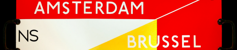
The new edition of the European Train Timetable has just been published. That’s good news.
The timetable used to be published by Thomas Cook; but they gave up on it a few years ago when it seemed that all this would become internet based. In fact, the printed timetable comes into it’s own when data roaming applies and when you’re not really sure where and when you’re travelling.
The timetable is a big seller too. Many copies are sold to people who travel in their heads…
You can read the full story, here
http://www.bbc.co.uk/news/business-26475256

Night Mail is a 1936 documentary film about an LMS mail train from London to Scotland, produced by the GPO Film Unit. A poem by W. H. Auden was written for it, used in the closing few minutes, as was the music by Benjamin Britten.
The film was directed by Harry Watt and Basil Wright, and narrated by John Grierson and Stuart Legg. The Brazilian filmmaker Alberto Cavalcanti was sound director. The locomotive featured in the film was Royal Scot 6115 Scots Guardsman, built in 1927. The film has become a classic.
You can watch the film, here

The film has a spoken commentary that describes how the service works…
Crewe Control? Euston Telegraph. One-Five-Seven Postal, left at eight-thirty.
Class six engine, three hundred and forty tons, twelve vehicles…Eight-thirty pm, weekdays and Sundays, the down Postal Special leaves Euston for Glasgow, Edinburgh, and Aberdeen.
The Postal Special is a fast express, but it carries no passengers. It is manned by forty Post Office workers. Half-a-million letters are sorted, picked up, or dropped, at full speed during the night; or carried on to the morning delivery in Scotland.

Four million miles every year! That bit is shouted out.
Five hundred million letters every year! That bit, too.
Trains from Lincolnshire and Derbyshire connect at Tamworth.
Trains from Warwickshire and Leicestershire connect at Rugby.
At thirty-four points between London and Glasgow postmen wait with local mails to deliver them to the Postal Special. The mails have been roughly sorted, by district. The postmen set up a net to catch the mail dropped by the train. They strap up the mail bags in strong leather pouches. The pouches are fixed to a standard by a spring clip.

A net is swung out from the train as it approaches the standard. The impact releases the spring clip and the pouches are swept into the train. Those letters were posted in Bletchley (Milton Keynes) half-an-hour ago.
Crewe, the main junction for the midlands.
Trains from Bristol, Cardiff, Manchester, Stoke, Liverpool and Birmingham, bring a thousand bags of mails for the north, between ten fifty-seven and eleven thirty-nine pm.
The Control Room.
Expresses are reported at regular intervals.
The scheduled stop for the Postal Special is thirteen minutes. Five hundred bags must be unloaded, a thousand loaded, engines changed, and some of the English crew exchanged for Scots.
North, with a hundred tons of new letters to sort. The Postal Special picks up and distributes the mails to industrial England; the mines of Wigan, the steelworks of Warrington, and the machine-shops of Preston.
There are seven sorting vans on the Postal Special. Each sorter has forty-eight pigeon holes, each representing a town. The packets are sorted separately.
As the train progresses, the names, scribbled in chalk over the pigeon-holes, have to be changed. When a pigeon-hole is filled the letters are tied in a bundle. The bundles are put into a labelled bag hanging behind the sorters. When the bag is full it is tied, labelled, and sealed, ready for dispatch by apparatus, or at the next stop.

The film finishes with a section where movement, image, sound and verse combine. The verse is by WH Auden and gives a sense of what this service means in terms of personal feelings and issues of community. Here is the text of Auden’s poem
This is the night mail crossing the Border,
Bringing the cheque and the postal order,
Letters for the rich, letters for the poor, The shop at the corner, the girl next door.
Pulling up Beattock, a steady climb:
The gradient’s against her, but she’s on time.
Past cotton-grass and moorland boulder
Shovelling white steam over her shoulder,
Snorting noisily as she passes
Silent miles of wind-bent grasses.
Birds turn their heads as she approaches,
Stare from bushes at her blank-faced coaches.
Sheep-dogs cannot turn her course;
They slumber on with paws across.
In the farm she passes no one wakes,
But a jug in a bedroom gently shakes.
Dawn freshens, Her climb is done.
Down towards Glasgow she descends,
Towards the steam tugs yelping down a glade of cranes
Towards the fields of apparatus, the furnaces
Set on the dark plain like gigantic chessmen.
All Scotland waits for her:
In dark glens, beside pale-green lochs
Men long for news.
Letters of thanks, letters from banks, Letters of joy from girl and boy,
Receipted bills and invitations
To inspect new stock or to visit relations,
And applications for situations,
And timid lovers’ declarations,
And gossip, gossip from all the nations,
News circumstantial, news financial,
Letters with holiday snaps to enlarge in,
Letters with faces scrawled on the margin,
Letters from uncles, cousins, and aunts,
Letters to Scotland from the South of France,
Letters of condolence to Highlands and Lowlands
Written on paper of every hue,
The pink, the violet, the white and the blue,
The chatty, the catty, the boring, the adoring,
The cold and official and the heart’s outpouring,
Clever, stupid, short and long,
The typed and the printed and the spelt all wrong.
Thousands are still asleep, Dreaming of terrifying monsters
Or of friendly tea beside the band in Cranston’s or Crawford’s:
Asleep in working Glasgow, asleep in well-set Edinburgh, Asleep in granite Aberdeen,
They continue their dreams,
But shall wake soon and hope for letters,
And none will hear the postman’s knock
Without a quickening of the heart,
For who can bear to feel himself forgotten?

Model railway layouts always seemed to include a TPO set with trackside pickup. Here’s a lovely big tinplate mail coach.

Here’s an image I found on the internet. I’ve been researching Night Mail, the GPO film about the travelling post office between London and Glasgow…
This is an image of an American postal wagon, circa 1920 I guess. I liked the typographic detail on the railway car.

Here’s a railway transparency from the US Library of Congress collection. The library has a group of pictures taken by an employee of the US Farm Security Administration.


Here is a page form the little Railway Quiz book I mentioned earlier….

We’ve been watching a US TV series called Hell on Wheels. It’s basically a revenge and redemption tale set in the aftermath of the Civil War and against the westward push of the transcontinental railway…
The visual style of the film is based on both Once Upon a Time in the West and Heaven’s Gate.
Terrific.


I have a theory that the vast skies, of the American mid-west, drove people mad…

I’ve posted before about Edward McKnight Kauffer. Here’s an early design, by him, for a cotton manufacturer in manchester. These simple labels were attached to bales of printed cotton for export to the South American market.
Kauffer produced a series of labels over a number of years, 36 in total – 1916 through to 1926.


